Hello ,
When it comes to how we work with color, whether we're making color or black-and-white photographs doesn't matter.
Since we live in a world of color, we should observe color as a compositional element and understand how it affects our pictures and how it affects those viewing our images.
What’s Color?
If we crack open a dictionary and look up the definition of color. We'll probably see something like these definitions found in The Merriam-Webster version.
1 a: a phenomenon of light (such as red, brown, pink, or gray) or visual perception that enables one to differentiate otherwise identical objects.
b (1): the aspect of the appearance of objects and light sources that may be described in terms of hue, lightness, and saturation for objects and hue, brightness, and saturation for light.
also: a specific combination of hue, saturation, and lightness or brightness.
(2): a color other than and as contrasted with black, white, or gray.
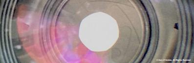
We live in a colorful planet. And our planet lives in a colorful galaxy. And our colorful galaxy resides in a colorful universe. We're swimmin' in color.
And I say swimmin' because the color is a wave.
So, here's some stuff I should've learned in high school physics class but didn't because I wasn't paying attention.
Instead, I learned about this stuff when I started studying and practicing photography.
And although I find this stuff interesting, beyond white balance settings on my camera, I don't make much conscious use of the physics of color as I do of the compositional use of it; there's more on that below.
I only get involved in some science when I'm working with transmitting artificial light sources.
So, here we go.
A Bit of Color Science
As mentioned, light is a wave. And lightwaves, like waves on water, are measurable.
Specifically, we can measure wavelength.
And the color of
something is determined by wavelength.
For definition's sake, the wavelength is the distance between two
consecutive wave peaks.
The shorter the wavelength, the bluer the light; the longer the wavelength, the
redder the light.
Color
in Transmitting Light Sources
We usually perceive "white light," which includes all colors. And if we pass white light through a prism, it enters as white light and exits as all colors from the spectrum. Sunlight is an example of white
light.
White light from the sun is a transmitting light source. But there're other types of transmitting
light, like lightbulbs. And lightbulbs have their own distinctive color but also can be made to mimic the color of white light.
Color in Reflective Light Sources
We usually pay the most attention to
colors in reflective light sources.
Green grass, blue sky, red roses, orange shirt, etc. Or, for you Lucky Charms
kids out there, yellow moons, orange stars, pink hearts, and green clovers
Here's how we see color in reflective
light sources.
When a transmitting light source bumps up against a light-reflective object, its waves are
absorbed and reflected by the object. The waves that get reflected are the colors we perceive it to be.
Now, while the above information may get you some points on a quiz show, beyond that, most of us only need to be aware of our use and understanding of color in terms of composition.
Color and Using It as an Element of Composition
Are There Different Types of
Colors?
Instead of "types," I prefer to use the word "characteristics. " And we can differentiate colors based on their characteristics or properties.
And there's three of 'em.
We got: hue, saturation and lightness, and brightness. (some call lightness and brightness "value")
Hue is the word we use to identify the color. Red, blue, green, brown, etc.
Saturation is the color's purity. Just the color, without any black, white, or grey added.
Lightness and brightness are just that. Think light green versus dark green.
Sometimes I think of this as the intensity of a color or its' vibrancy or dullness. Another way to think about color intensity is as a color's distance from gray on the color wheel.
Where Can We See Color in Photographs?
Suppose we're using color film, viewing color prints, or looking at our LCD screen on our digital camera after making a color image. In that case, we see color throughout the content of the
picture.
And if we're working in black and white we see colors reproduce in our work as shades of
grey.
How To Study and Practice With
Color
The most direct way is to pay attention to it and regard it as an element of composition.
And remember that we experience color as a sensation.
It affects us physically, emotionally, and psychologically.
Also, remember this phrase that's been floating around for a while. "…color is like dynamite – dangerous, unless you know how to use it."
And because of colors' strength in imagery, color can make or break our picture.
So, when making pictures in color, we shouldn't just look at the placement of it within our framing and content; we should also experience and examine how the color "feels" and affects us as a body-mind sensation.
And if we really want to dig into this stuff, we should do some research.
Specifically, research and learn about color theory, schemes, and psychology.
And make sure it's a reputable source. My go-to place is Pantone.
Depending on how we work, we can consider color more, or we can consider color less.
But if we're creating color photographs and want to use color intentionally in our work, we should learn all we need to know to use it the way(s) we want.
And remember, we learn and become better by doing, so make sure to
practice by making at least one picture today.
That’s all for now; thanks for reading!
Sam
Study and practice photography with me.
And if the timing doesn't work for you in any of my scheduled group classes, we can schedule a one-time lesson or a series of in-person or online one-on-one private instruction that cover the same things as any of my group classes.